My AI-Generated UIs Looked Like Every Other AI-Generated UI. Then I Found Frontend-Design.

Get the tool: frontend-design Official version: anthropics/skills/frontend-design
The Uncanny Valley of AI Design
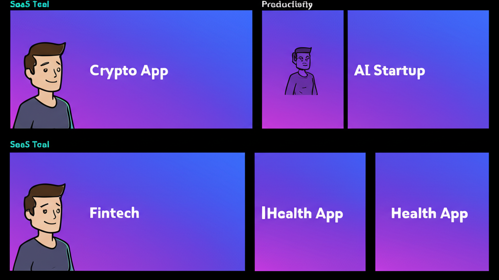
You've seen it. The gradient that goes from purple to blue for no reason. The card with the suspiciously perfect border-radius. The hero section with the floating abstract shapes that could be on literally any website built in 2024.
I call it the "AI aesthetic." It's not bad, exactly. It's just... recognizable. Every AI-generated landing page looks like it graduated from the same bootcamp. Same shadows. Same spacing. Same soulless perfection.
I was building a new page for stencilwash.com last month. Standard request: a landing page with pricing cards, some testimonials, call-to-action buttons. I prompted Claude, got back a perfectly competent React component, and immediately knew something was wrong.
It looked like AI made it.
Not broken. Not ugly. Just... generic. The kind of generic where you squint and think "is this a SaaS product or a cryptocurrency exchange? A productivity tool or a mindfulness app?" The design communicated nothing except "a computer made this."
Enter the frontend-design skill from agents-skills-plugins, and suddenly my AI-generated UIs started looking like actual products.
The Before: Generic AI Output
Here's what I was getting before frontend-design. A pricing card component:
// Before: The AI Aesthetic™
const PricingCard = ({ plan, price, features }: PricingCardProps) => {
  return (
    <div className="bg-gradient-to-br from-purple-500 to-blue-600
                    rounded-2xl p-8 shadow-xl transform hover:scale-105
                    transition-all duration-300">
      <h3 className="text-2xl font-bold text-white mb-4">{plan}</h3>
      <div className="text-5xl font-extrabold text-white mb-6">
        ${price}<span className="text-lg">/mo</span>
      </div>
      <ul className="space-y-3 mb-8">
        {features.map((feature, i) => (
          <li key={i} className="flex items-center text-white">
            <CheckIcon className="w-5 h-5 mr-3 text-green-300" />
            {feature}
          </li>
        ))}
      </ul>
      <button className="w-full bg-white text-purple-600 font-bold
                         py-3 rounded-xl hover:bg-gray-100 transition">
        Get Started
      </button>
    </div>
  );
};
Nothing wrong with this code. It works. It's accessible. It follows best practices.
It also looks exactly like the output of every other AI prompt asking for a pricing card. The purple-to-blue gradient. The hover:scale-105 that shows up in every AI component. The shadow-xl that's always a little too dramatic. The suspiciously round rounded-2xl.
I could have shipped it. Nobody would have complained. But I'd know. Every time I looked at stencilwash.com, I'd feel that uncanny valley sensation. "A computer made this, and it shows."
The After: Frontend-Design Output
Same request, but this time I invoked /frontend-design first:
// After: Distinctive, intentional design
const PricingCard = ({ plan, price, features, highlighted }: PricingCardProps) => {
  return (
    <div className={`
      relative border-2 rounded-lg p-6
      ${highlighted
        ? 'border-amber-500 bg-amber-50'
        : 'border-gray-200 bg-white'}
    `}>
      {highlighted && (
        <span className="absolute -top-3 left-4 px-2 py-0.5
                         bg-amber-500 text-white text-xs font-medium
                         rounded tracking-wide">
          RECOMMENDED
        </span>
      )}
      <h3 className="text-sm font-medium text-gray-500 uppercase
                     tracking-wider mb-3">
        {plan}
      </h3>
      <div className="flex items-baseline gap-1 mb-6">
        <span className="text-4xl font-semibold text-gray-900">${price}</span>
        <span className="text-gray-500">/month</span>
      </div>
      <ul className="space-y-2.5 mb-6 text-sm">
        {features.map((feature, i) => (
          <li key={i} className="flex items-start gap-2 text-gray-600">
            <Check className="w-4 h-4 mt-0.5 text-gray-400 flex-shrink-0" />
            <span>{feature}</span>
          </li>
        ))}
      </ul>
      <button className={`
        w-full py-2.5 rounded font-medium text-sm transition-colors
        ${highlighted
          ? 'bg-gray-900 text-white hover:bg-gray-800'
          : 'bg-gray-100 text-gray-900 hover:bg-gray-200'}
      `}>
        Start free trial
      </button>
    </div>
  );
};
Different, right?
No gratuitous gradients. No scale-105 on hover. Intentional color choices (amber for the highlight, not another purple-blue situation). Typography that has actual hierarchy. Spacing that breathes without being dramatic.
Most importantly: it looks like a decision was made. Someone chose amber over purple. Someone decided the plan name should be small and uppercase. Someone picked rounded-lg instead of rounded-2xl because it fits the overall design language.
That someone was Claude, but with the frontend-design skill guiding it toward intentionality instead of defaults.
What Frontend-Design Actually Does
The skill focuses on a few key principles that change everything:
1. Avoids the Generic AI Aesthetic

The skill explicitly trains Claude to recognize and avoid patterns that scream "AI generated." Those purple-blue gradients? Gone. The hover effects that exist purely because they can? Reconsidered.
2. Enforces Intentional Design Decisions
Instead of throwing every utility class at the wall, frontend-design pushes for coherent design systems. Colors relate to each other. Typography follows a scale. Spacing is consistent.
3. Prioritizes Production Quality
This isn't about making things pretty - it's about making things shippable. Real components with real states. Proper TypeScript. Accessibility baked in. The kind of code you'd actually commit to a production repo.
4. Contextual Awareness
When I was building for chainbytes.com, the skill generated components that felt different from the stencilwash.com work. Because different products need different design languages. A Bitcoin infrastructure company shouldn't look like a pressure washing service, even if both need pricing cards.
The Workflow That Changed My Process
Here's how I use it now:
- Start with
/frontend-designbefore asking for any UI component - Describe the brand context - "This is for a professional service, not a consumer app"
- Get the first pass - Claude generates something that's already more intentional
- Iterate on specifics - Now I'm tweaking design decisions, not fighting generic outputs
The skill asks me questions I'd normally skip:
- What's the overall visual tone? (Clean and minimal? Bold and expressive?)
- Are there existing brand colors I should work within?
- What components already exist that this should feel cohesive with?
These aren't just prompting tricks. They're the questions a senior designer would ask before touching Figma. The skill brings that discipline to AI-assisted frontend work.
A Real Example: The CTA Section
I was building a call-to-action section for a landing page. Generic AI output gave me this:
// The generic version
<section className="bg-gradient-to-r from-indigo-600 to-purple-600 py-20">
  <div className="max-w-4xl mx-auto text-center px-4">
    <h2 className="text-4xl font-bold text-white mb-6">
      Ready to Get Started?
    </h2>
    <p className="text-xl text-indigo-100 mb-8">
      Join thousands of satisfied customers today.
    </p>
    <button className="bg-white text-indigo-600 px-8 py-4 rounded-full
                       font-bold text-lg shadow-lg hover:shadow-xl
                       transform hover:-translate-y-1 transition-all">
      Start Your Free Trial
    </button>
  </div>
</section>
After frontend-design:
// The intentional version
<section className="border-t border-gray-200 bg-gray-50 py-16">
  <div className="max-w-2xl mx-auto px-4 text-center">
    <h2 className="text-2xl font-semibold text-gray-900 mb-3">
      See it in action
    </h2>
    <p className="text-gray-600 mb-6">
      Schedule a 15-minute demo. No commitment required.
    </p>
    <div className="flex items-center justify-center gap-3">
      <button className="px-5 py-2.5 bg-gray-900 text-white rounded
                         font-medium hover:bg-gray-800 transition-colors">
        Book a demo
      </button>
      <a href="/docs" className="px-5 py-2.5 text-gray-600
                                  hover:text-gray-900 font-medium">
        Read the docs
      </a>
    </div>
  </div>
</section>
The second version isn't "better" in some objective sense. But it's specific. It's appropriate. It looks like it belongs to a real product, not a template marketplace.
When to Use Frontend-Design
- Building landing pages - Where first impressions matter
- Creating component libraries - Where consistency is everything
- Designing dashboards - Where clarity beats decoration
- Prototyping new features - When you want something shippable from day one
- Any time you're about to get purple-blue gradients - Use it as a preventive measure
The Honest Truth
I'm not a designer. I can recognize good design when I see it, but I can't produce it from scratch. For years, that meant settling for "good enough" or spending hours on Dribbble looking for inspiration I couldn't quite translate into code.
Frontend-design doesn't make me a designer. It makes AI-assisted frontend work feel less generic. It's the difference between "an AI made this" and "someone built this with intention."
That's worth a lot when you're shipping real products.
The skill is part of the agents-skills-plugins collection, alongside brainstorming, debugging, and other workflows I've written about before. If you're tired of fighting generic AI output, start there.
"Generic is easy. Distinctive takes intention."
Ship frontends that look like decisions were made. Your users can tell the difference, even if they can't articulate why.
One reaction per emoji per post.
// newsletter
Get dispatches from the edge
Field notes on AI systems, autonomous tooling, and what breaks when it all gets real.
You will be redirected to Substack to confirm your subscription.